KORO
Year
2025
Client
Koro
Scope
Visual Identity
Overview
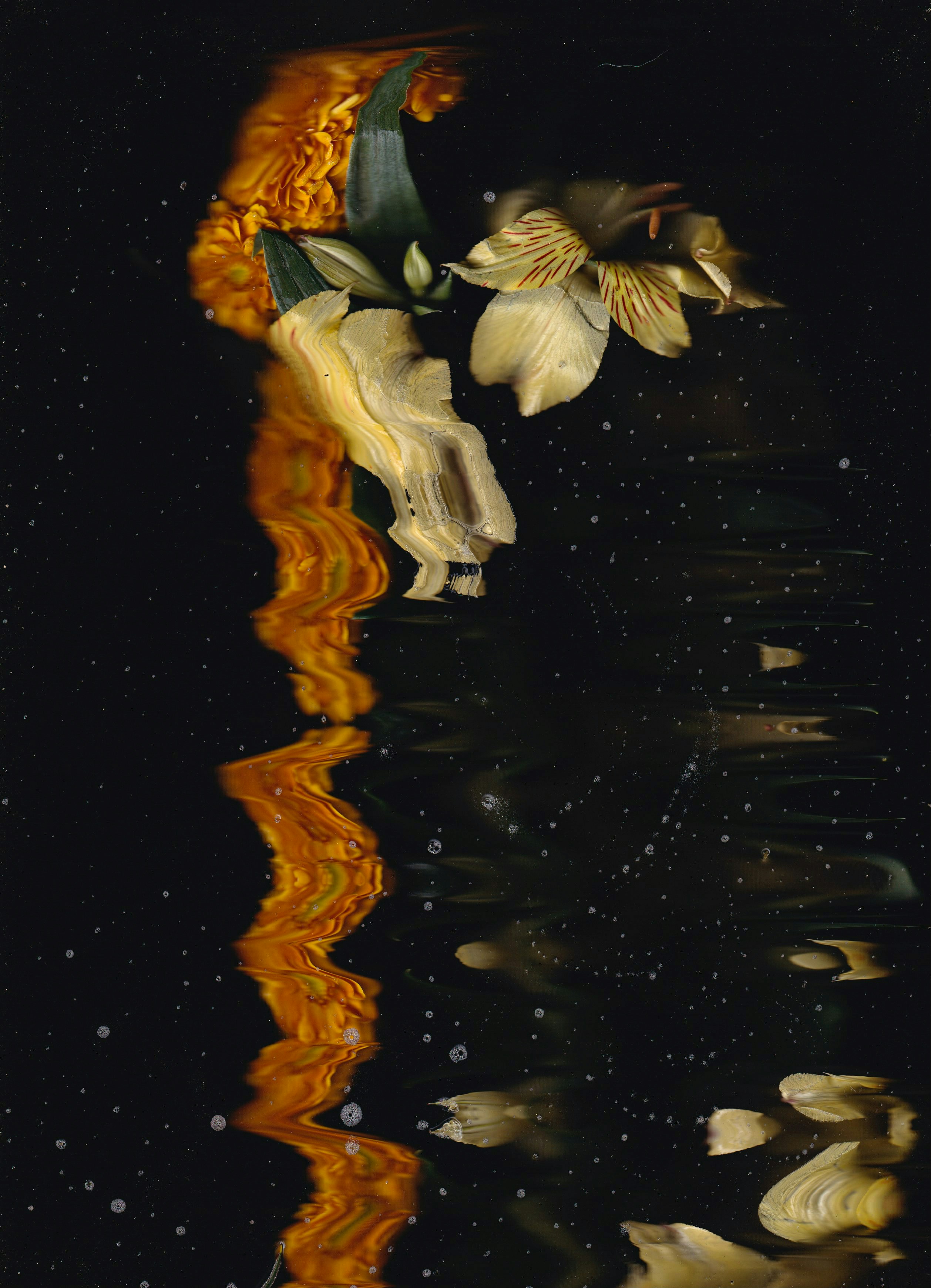
Visual Identity for Koro
Interested to work with us?


Description
This project focused on developing a visual identity system that aligns with the client’s positioning, audience, and brand values. Our role covered logo design, color strategy, typography, and key brand assets — with an emphasis on consistency across both print and digital environments.
The goal wasn’t just to make something look good, but to build a system that could grow with the brand and stay relevant over time. We worked closely with the client to understand what mattered most, and shaped the visuals around that.
Throughout the process, we balanced structure with flexibility — giving the brand enough control to evolve, without losing coherence.
Problem
The client approached us with a mix of challenges — visual inconsistency, unclear messaging, and a brand presence that didn’t reflect their direction anymore. Their current identity no longer supported new product lines, digital platforms, or internal use.
There was also a lack of visual guidelines, making it hard for different teams to maintain clarity across content. Without a strong system in place, every design decision felt disconnected and reactive.
They needed a reset — one that clarified the brand’s core and helped streamline how it communicates visually, internally and externally.
Result
We delivered a full identity system with key assets, guidelines, and use-case examples. The new visuals feel modern but grounded, and have already been applied across packaging, digital platforms, and marketing material.
The brand now has a flexible toolkit it can use confidently across channels — whether it’s launching a new product, updating a landing page, or briefing a third-party designer.
Post-launch, the client reported improved team alignment and positive audience feedback. More importantly, the brand finally feels like it fits the company it’s become.